Original Visual Guide
Earlier visual material stays visible inside the main site.
English image-led site
This site combines large readable images, guided galleries, and clear written explanation so readers can follow space topics without losing their place.
More text now sits across the home page so visitors understand the sections before they open the images or start the loop.
How this .com site works
This English .com site gives images a bigger role. Readers can look at a poster, open it larger, listen to the page, and keep reading simple explanation blocks that say what the image shows, what it means, and why it helps the audience.
Built for your doelgroep
The images now use contain-style presentation, dark framing, clear headings, and extra description. That means posters remain visible and easier to understand. The site also repeats Home routes, section routes, and calmer buttons so the whole experience feels more guided.
Original .com foundation
You see a dark poster with one bright circle in the middle and smaller details around it. The design pulls your eye inward first, then outward. It feels like a beginning, a first stop, or a clear entry point.
You see a blue-toned image with a central globe-like shape. The colours feel steady and familiar. The page looks calmer and more grounded than a bright, busy visual.
You see a darker and softer image with less visual pressure. It feels slower, quieter, and more reflective. The card is not trying to rush the visitor.
You see warmer reds and oranges, stronger contrast, and more visual energy. This card feels more active, more forward-looking, and more practical.
You see a larger central object with a strong sense of scale. The image feels weighty, serious, and stable. It suggests presence and protection.
You see a bright golden image with a very strong centre. The visual is warm, clear, and impossible to miss. It naturally acts like a guide or signal.
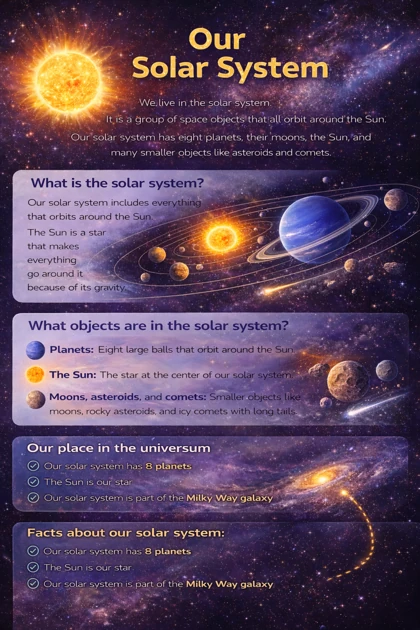
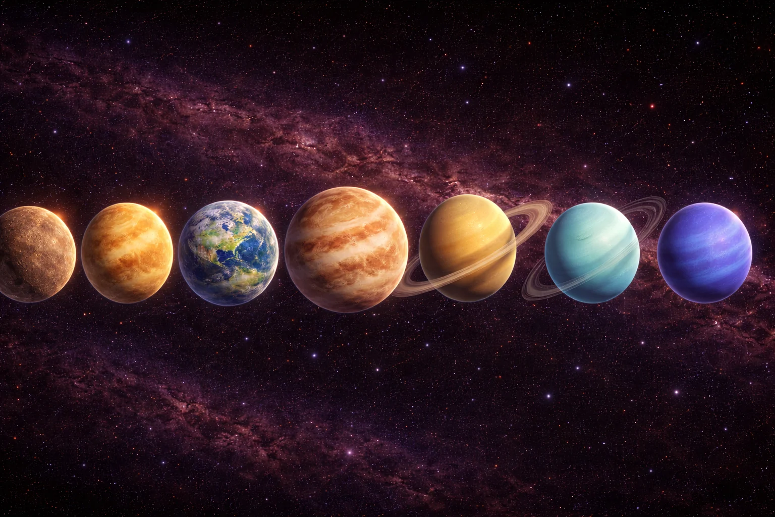
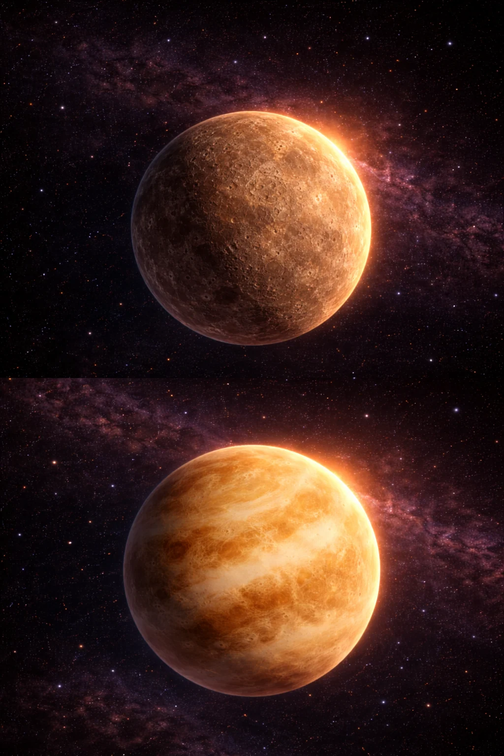
Planets
The site now includes the main planet posters and the older inner-planet images you wanted to keep. Together they create a larger planet section that feels more complete instead of replacing one version with another.
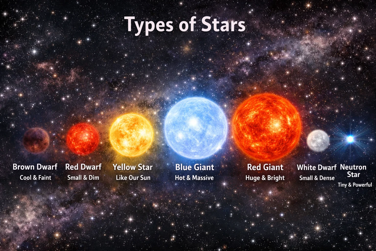
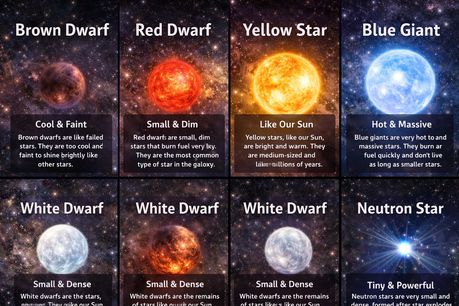
Stars
The star section now combines direct explanation pages with poster-style comparison images, so there is both calm text and a stronger picture overview for visitors who learn visually.
Young readers
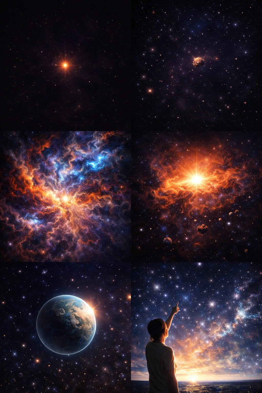
A busy collage of galaxies, glowing discs, and planets that gives young readers a first feeling of space as a huge and colourful place.
A collage full of glowing spheres and star groups that works well for a page about many shapes, lights, and patterns in space.
A set of space scenes with small bright points and spirals that invites quiet looking and simple comparison.
A scene that mixes deep space with a person looking upward, helping children connect astronomy with wonder and imagination.
A calm image that links the night sky with human curiosity and shared looking.
A warm landscape image for pages about discovery, family, and the feeling of starting a journey.
Whole-site loop
The dedicated image loop page brings together featured visuals from the full site. That makes it easier to test the site live, show it to other people, or let a visitor keep watching while you talk through the pages.
Archive
The image archive page stays in the site on purpose. It gives the older uploads a safe home while the newer layout does the work of navigation, explanation, and accessibility.
More written explanation
This home page is the main entrance for the full English .com site. It introduces the image collections, explains what visitors will find, and shows how each section supports a different kind of reader. That makes the site easier to trust and easier to use.
The image loop at the top gives a quick feeling for the site, but the text below slows everything down again. Visitors can move from the loop into planets, stars, visual guides, young-reader pages, and the image archive without losing the thread. Each route now works better when a visitor arrives for the first time and needs context.
This matters for your doelgroep because some readers come for calm explanation, some come for visual learning, and some simply want a larger image that still keeps navigation close by. The site now treats those needs as part of one whole experience instead of separate ideas.
Why this page helps
A picture can pull people in very quickly, but text gives the page meaning, structure, and trust. When a visitor knows what they are seeing, what they should notice, and where to click next, the site feels far more finished.
That is why this page set keeps the strong visual idea but adds more explanation blocks across the pages. The result is a bigger site with more reading value, not only a gallery of nice images.